Monday, 27 March 2017

Getting Back on Track

Took a break from blogging and keeping up with other artists posts - in fact most computer related activities in general. Still painting but has been good to take a break from technology. I have a couple of workshops coming up in April and have been gearing up for them. For me this means checking that our favourite dog walker is available, meals are prepared in advance and of course the all important supply list has been checked and double checked. At this point in my painting life I don't require much in the line of supplies. Have enough paint to last a lifetime and paper too! I will be doing some prepping of paint surfaces as required by the instructor. As the date gets closer I will share info about the instructor and some of their art work.

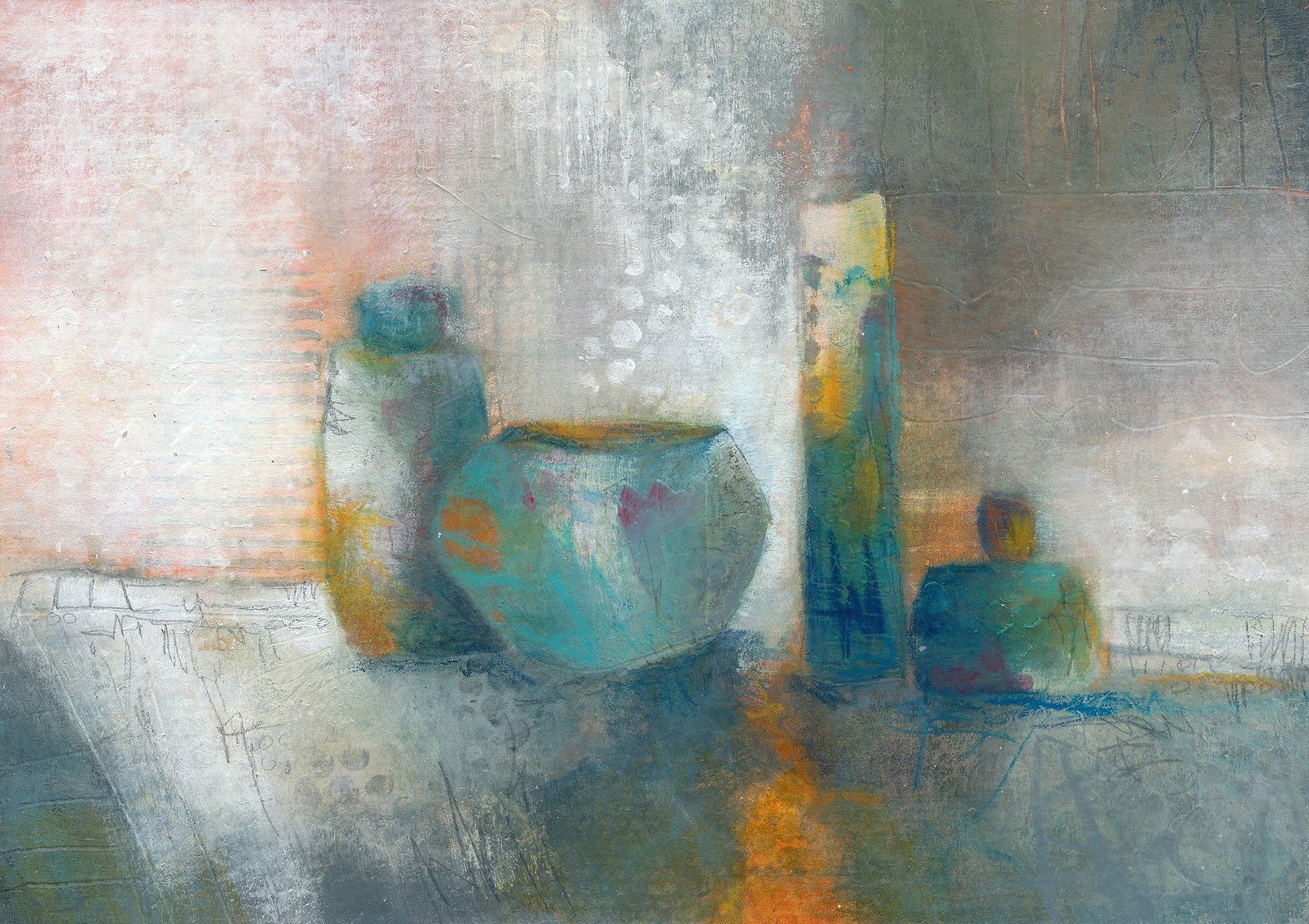
The picture I am posting today took more time than I had planned. I worked with neutrals and added colour near the end. I am doing more and more lifting of paint to expose some of the older paint layers. I enjoy taking the paint off, just as much as putting it on. Can never really be sure what will be exposed!


'Vessels #12'
Acrylic mixed media on
Arches 140lb hot press paper

Wherever you are - happy creating!


Monday, 6 March 2017

A Painting Day with Friends

I paint with a small group of friends. We have known each other a long time. Most of us met through our local painting group and that other common thread family. Six of us gathered at my home yesterday. There was food a plenty, multiple conversations going on at once and of course painting. Acrylics, watercolour, coloured pencil and graphite were some of the materials of choice. We started with a quick warm up - this involved displaying an image (in this case calendar photos) and having 40 seconds to draw/paint that image. We did a total of 8 of these quick studies. This is such a good exercise - forces me to edit out most of the details and look at shape, line and value.


One of the original calendar images and a sampling of the some '40 second' sketches.


4"X6"


I did a small painting - not from a quick sketch though. I used acrylic paint (titanium white and a premixed grey), watercolours, Inktense pencils and 8B graphite. I have never mixed these twos mediums so it was an experiment that at times I thought was going horribly wrong or seemed to be working. I put some of the acrylic paint down first and 'drew' into it with a pen and then started adding watercolour and then more acrylic. As soon as the second layer of acrylic met the watercolour (which was dry) the watercolour pigment mixed with the acrylic. My first thought was to quit and just use watercolour, but I decided that maybe I could make something out of the original smudges. So continued painting with both mediums, spritzed with water and rubbed and lifted with paper towel. I do like how the titanium white and watercolour mixed to make some great opaque areas. This is probably nothing new to some of you but this was the first time I had tried mixing the two media together. I am looking forward to more 'experiments' in the 'art lab'.


6"X6"
Mixed media on 140lb
rough watercolour paper


Tuesday, 28 February 2017

'The Impatient Painter'

I am an 'Impatient' painter today....this isn't the first time, nor will it be the last. I have been picking away at this painting for a couple of days - a little bit here, a little bit there. It is not that big, but it was causing me a lot of grief - of my own making! I am challenging myself by working with value first and adding colour at the end - you know the saying - 'value does all the work and colour gets all the credit'. I did mix the colours with a limited palette and tried to keep them more on the neutral side. Went with a very dark value right away for the vessels and tried working my way up the value scale.

These are a couple of scans of the painting in progress


Putting in some dark values


A ways in to the painting process. A bit too enthusiastic and painted out most of the darks. Experiencing a certain level of frustration so starting playing with the background


....I couldn't wait any longer and had to add some colour (these are not even my go to colours!)....


'Vessels #10'
11"X11"
Acrylic mixed media on
Canson watercolour paper

This painting isn't quite the end result I was looking for, but I think it is a good first start. I am going to continue working with value in a more mindful way, on a daily basis and as time allows. Practice, practice, practice!!

Thanks for stopping by.


Friday, 24 February 2017

Painting - The 'Palette Cleaner'

I know I am not the only one who does not like to waste paint. I don't like to waste anything and some of the 'stuff' I am uncovering in my studio is evidence of this....a conversation for another day. This 'palette cleaner' was done at the end of the day. A small painting, limited colours and painted quickly. No time for picking away! Some make great studies to use for something bigger and some when matted end up being a lovely little gem to display. I think these might make an interesting series to do over the year.


'Palette Cleaner #1'
5"X5"
acrylic mixed media on
Somerset printmaking paper

Thanks again for taking the time to visit and leave a comment - your support is greatly appreciated!


Wednesday, 22 February 2017

Painting and Reorganizing

It seems that January and February are a time for cleaning up and sorting out artist studios. I have noticed a couple of artists that I follow have been working on this. I have been doing a slow and methodical sort this month. Today I went through a couple of boxes of frames in my studio. I use to do my own framing (monoprints, watercolours and water colour collages) but am not doing as much now that I am painting with acrylics and using birch panels and canvas as my supports. The frames have been catalogued according to size and colour and put in a more accessible storage spot. I might even have freed up 'one square foot'!! Might seem like more work than it is worth, but I feel pretty good having done it and putting a check mark beside that task. Only about 25 items to go!

I have been painting though. Going through workshop notes dating back to 2014 - a bit of a refresher and is well worth the time. Sticking with a smaller format and experimenting with colour themes (example...complementary, monochromatic, etc), mixing colours and neutrals and rereading for the umpteenth time the elements and principles of design. Wherever you are and whatever you are doing I hope you have a great day!


Before the background on the left was adjusted

'Vessels 9'
5"X7"
Acrylic mixed media on
Canson mixed media paper
The background could use a bit more work, but I think I will leave it as is and 'paint another'! Used two blues, an orange, black and white. Good practice for colour mixing. Did add a bit of pencil and watercolour crayon for some finer details.

8"X10"
Acrylic mixed media on
Canson mixed media paper

This is still a work in progress. Want to tone down the foreground even more. Will try mixing a dark grey and see if that works. If not can always add more neutral or get out the rubbing alcohol and strip some of the paint off.


Friday, 17 February 2017

Painting - 'Which way is the right way'

'Which way is the right way' can apply to a lot of things in the art world. What I am thinking about is - which way should the painting be hung? When I paint, I am now constantly turning the painting (that wasn't always the case). I have learned that it keeps me from getting bogged down in details and a fixed idea of what things should look like - it opens up the possibility to discover an even better painting than what I first thought was the right way. Even once I have decided what is the right way, I will continue to paint and turn right up to the final few strokes. I actually think my line work is much freer and more spontaneous working this way. Just for fun I am posting the painting in 4 different positions.


Acrylic mixed media on 
Arches140lb hotpress paper

'A'
'B"


'C'
'D'


Image 'B' is what I was originally thinking was the finish, but now I am not sure......kind of like 'C' as well. One thing I  notice viewing the image - I want to extend or change the magenta shape (lower right).


'B'
Acrylic mixed media on
Arches 140lb hotpress paper


Please share you ideas about this topic and also which way you think is the 'right way' - I will be interested to hear.

Have a great weekend - we are enjoying sunny weather and above 0 temp's - will definitely be spending some time outdoors.


Wednesday, 15 February 2017

Mono Printing - Materials and Techniques

Victoria & Albert
6"X8 1/2"
Monoprint on BFK

Thanks to everyone who visited yesterday's post. Lots of questions about some of the materials and techniques I used for the monoprint. Would like to follow up and answer those questions and provide a bit more detail. Will try to keep this to a reasonable length! So, I cannot take credit for all the info shared in this post. I attended a 5 day monoprint workshop in the mid 90's with Canadian artist Jeremy Mayne and this info is from notes I took during the workshop. I have done some of my own experimenting with materials and pigments but the basics were generously shared by Jeremy during the workshop.

I use water based materials for monoprinting. (easy to clean up, not as toxic as some materials) Mainly gouache (has good viscosity, stickier, tackier and can turn transparent once printed), sometimes watercolour (depends on the colour - quins print well), any water soluble pencils (will print, but not putting down a lot of pigment, good for working back into the print), crayons and inks, graphite sticks (4B or higher if you want to print), chalk pastels (use a good quality, can grate and rub on). You can give water soluble oils a try, but you must print them while still moist. If you use a non-soluble material (ex. ink) it will not not print and will act as a resist. **Put more pigment on than you think you will need. There are lots of interesting water based materials available and I would encourage you to experiment and have some fun.

I use a metal plate for my support - off set litho sheets will last a lifetime. You can use wood (have to seal first), plexiglass (cannot leave paint on for any length of time, need to print same day), glass, lino, mylar, acetate, even paper (one use only). Because I use metal I am more familiar with prepping it before printing - needs to be sanded (I use a barbeque scrubber)- sand horizontally, vertically and diagonally. This will last for a long time before you have to do it again.

Before I paint on the plate I apply a mixture of glycerin and gum arabic (approx. 4oz gum arabic to 26 drops of glycerine). The gum arabic increases the viscosity of the pigment and helps release the image from the plate, retains the integrity of your marks and prevents bleeding. The glycerine slows down the drying time of the paint. This mixture has to be dry before you can start painting.

*It is important to sand and apply the glycerin/gum mixture to the plate - if you don't will end up with imagery that bleeds.

So, now you are ready to print...Soaking the paper is the most important aspect of printing. This has to be right. Not too wet - not too dry! Do not over-wet your paper as this will cause your pigment to run! You will need to experiment with the soaking time -  I live in a very dry climate so my average time for soaking the paper is 4 and 1/2 minutes. Remove excess water after soaking with a squeegee (on the wrong side of the paper) then placing between 2 sheets of blotting paper and roll with a rolling pin and finally using a clean brush to raise the nape on the right side of the paper before printing. Check for dry spots and the paper should be 'cool' to the touch.

You can print by hand, but I have an etching press that I use -much less labor intensive. My favourite printmaking paper is BFK Rives. I have tried other printmaking papers but for me the BFK works like a charm every time!

This is really just a barebones description of how I like to make a mono print. I would encourage you to check for workshops where you live, on-line videos, books, etc. There are lots of different techniques and thoughts on mono printing. I make detailed notes on all my monoprints - sketches, pigments used,  what did and didn't work, colour swatches, how long the paper was soaked, etc - this is invaluable info to have. Most of all enjoy trying something new and the adventure of experimenting!

Below are some of the mono prints I have enjoyed creating. Have a wonderful day


Monoprint journal entry


'Bye the Sea'
Monoprint on BFK Rives


'The Philosopher'
22"X30"
Monoprint on
BFK Rives


11"X14"
Monoprint on BFK Rives